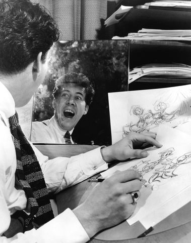
In the history of The Walt Disney Studios, animator Fred Moore (1911–1952) is considered among the leading artists who helped originate and define the Disney style, matching appealing design with believable performance. In particular, Moore was instrumental in the evolution of Mickey Mouse as an animated character, and his legacy with the Disney icon’s appearance remains evident today.
Jenny Lerew is a story and development artist, as well as an author and historian who writes about animation on her blog "The Blackwing Diaries". Her books include The Art of 'Brave' and the forthcoming Art and Life of Fred Moore for Disney Editions. The Southern California resident graciously fielded questions on Moore, Mickey, and the art of animation via Consulting Historian for The Walt Disney Family Museum, Lucas O. Seastrom.

Lucas O. Seastrom: How did you become interested in Fred Moore’s work?
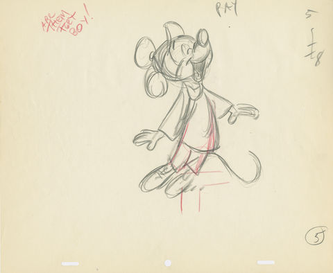
Jenny Lerew: As a kid, I was given Christopher Finch’s huge book The Art of Walt Disney—at that time the most comprehensive collection of Disney animation art that had been done. Amid hundreds of pages of beautiful drawings, one in particular struck me: a rough sketch of Mickey Mouse as the Brave Little Tailor [from the 1938 cartoon]. The lines were loose and graceful; the character solid and full of personality. It was an instantly lovable representation of Mickey, and it was credited to Fred Moore. Other drawings of his were peppered throughout the book. The more I saw of his work, the more I determined to learn about the artist responsible, but at that time there was very little about him in the public sphere. Happily, he’s much better known now than he was then, thanks in large part to two of his former assistants, animators Frank Thomas and Ollie Johnston, who made sure he was profiled in their book Disney Animation: The Illusion of Life. Although he died at age 41 in 1952, his legacy continues to delight and influence others—whether animation professionals or fans—who know his work, if not his name.
LS: Can you give us a brief summary of Fred Moore’s early career at the Disney Studios?
JL: Fred Moore was hired in 1930 at age 18, a self-taught artist straight out of high school. The Disney Studio was already at the top of the cartoon industry thanks to Walt Disney’s commitment to continual improvement of his animated shorts, and key to that improvement was being open and eager to hiring new talent. At the same time, animation was beginning to be known as a possible job option for entry-level artists with a talent for drawing. It was the beginning of the Great Depression; jobs of any kind were scarce, and Fred jumped on the opportunity.
Like most inexperienced hires, he started in the inbetweener pool, moving on to doing small bits of animation under more seasoned artists. He advanced rapidly, gradually given his own scenes, and within two years was contributing animation that was clever and entertaining—particularly when featuring Mickey Mouse. By 1933, he’d established himself as an important animator in the ranks of the veterans who preceded him.

LS: Of the many skilled artists present at the Studios during this time, why was Fred Moore the animator to take on Mickey Mouse?
JL: Fred was in the right place at the perfect time. It’s often been said that Walt was brilliant at managing talent, with a keen eye for recognizing an artist’s strengths and placing them where they could do the most good. In the 1930s, all of Disney’s energy was focused on making his films the best, constantly improving their entertainment value, and he went further than any other animation producer in his pursuit of quality. Nothing at the Studios escaped his notice, and if an artist showed some spark in his animation, Walt encouraged and insisted on more of the same. An artist whose work was perhaps a little too stiff, or a little less interesting, believable, or entertaining [usually] wouldn’t last long. Many applied, came, and went quickly.
Fred Moore arrived at the Studios as a teenager with an unspoiled talent that was perfect for animation. His childhood had been scrappy—he came from a family with meager resources, for one thing—but his outlook was invariably described as sunny. He was well-liked, had loads of energy, curiosity, and he was ambitious. Mickey Mouse in 1930 was a scrappy, optimistic character himself—young, irreverent, and ready to tackle anything. They really were two of a kind.

Of course, none of this would have mattered had Fred not quickly developed as an excellent animator with a natural sense of rhythm and grace in his drawing, and an understanding of movement. While artists like Dick Lundy and Les Clark were doing top-notch animation of Mickey, Fred’s scenes began to show an approach to animating the Mouse that was so appealing that he set the standard for everyone else.
That’s the word that Frank, Ollie, and everyone at the Disney Studios associated with Fred Moore: “appeal.” He seemingly could not make a drawing without it, nor animation that didn’t include it. Appeal—an innate likability, something that was a joy to see—was the x-factor that Mickey already had before Fred arrived on the scene but increased to bigger and better heights thanks in no small part to Fred’s influence on how he looked and moved.
There’s an anecdote of a couple of Disney employees chatting in the Ink & Paint building, observing Fred Moore walking across the campus in his typically jaunty fashion, prompting one of them to say, “There goes Mickey Mouse!” Fred—youthful, exuberant, full of fun—seemed to imbue the Mouse with his own spirit, and in return Mickey, in ever-better performances, made Fred’s early reputation soar.

LS: We often hear the phrase “squash-and-stretch” in relation to hand-drawn animation, but what does this mean to the typical viewer?
JL: “Squash-and-stretch” refers to animating characters with drawings that have volume, weight and elasticity when they move. It’s a fundamental principle of animation that’s easy to understand when you see it in action—not so easy to describe in words! To quote Fred Moore about what makes good animation work: “Don Graham[, a drawing instructor at the Studios,] can give you the rule. I just say it looks better.”
Where Mickey is concerned, his early design was made up of very simple shapes—basically circles and “rubber hose” arms and legs. He moved all over the place, but his body and head shapes stayed fairly rigid and “hard” throughout. That worked well for the early cartoons, which depended on inventive sight gags and situations and very broad reactions from all the characters, but it was also limiting in what the animators could do as far as getting more interesting performances into the cartoons.
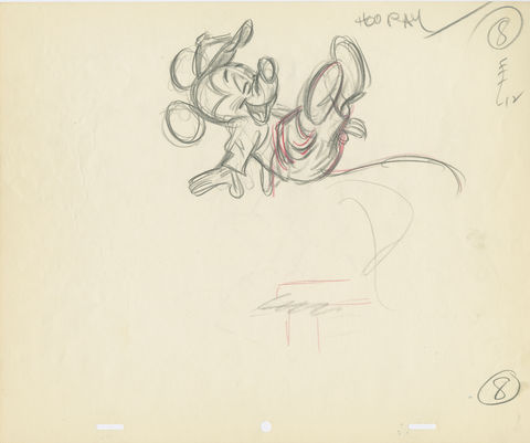
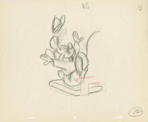
To make a character like Mickey “act” convincingly he had to have more of a feeling of physical reality when he moves any part of his body. That means drawing the shapes that make up his face and body so that they seem to squash and stretch—react to physical forces. That can only work if a character is designed with pliable shapes that can be exaggerated but maintain their volume and feeling of reality. For that to work with Mickey he needed to be redesigned from his former rigid shapes. That “new” design of Mickey, having his body become more pear-shaped and pliant, with his shoulders, arms and legs more integrated into a pleasing overall structure, is credited more to Fred Moore than anyone else. It was a way of drawing that he applied to all of the characters he animated, whether Mickey, the Three Little Pigs, or the [title characters] in Snow White [and the Seven Dwarfs].
This article is Part I of a two-part interview with author Jenny Lerew. Part II can be found here.

–Lucas Seastrom
Lucas O. Seastrom is a writer, filmmaker, and contracting historian for The Walt Disney Family Museum.
Image credits (in order of appearance):
- Fred Moore drawing Donald Duck and Jose Carioca, The Three Caballeros (1944); courtesy of the Walt Disney Archives Photo Library, © Disney
- Fred Moore, rough animation drawing scene, Pluto Plays Football (unproduced, c. 1952); courtesy of Andreas Deja, © Disney
- Fred Moore, rough animation drawing scene, Pluto Plays Football (unproduced, c. 1952); courtesy of Andreas Deja, © Disney
- Fred Moore, rough animation drawing scene, Pluto Plays Football (unproduced, c. 1952); courtesy of Andreas Deja, © Disney
