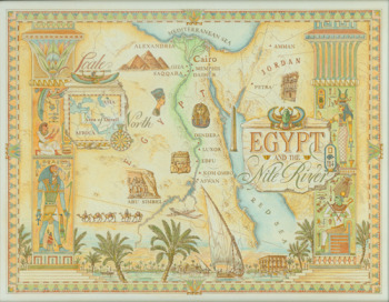
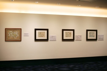
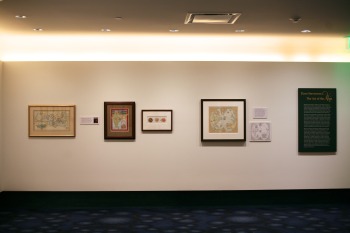
 We are proud to announce our latest exhibition, Dave Stevenson and The Art of the Map, that is currently on display in our Theater Lobby. One of his maps details the migration of the Disney family from Europe to America.
A freelance illustrator for more than 20 years, Mr. Stevenson grew up in Sonoma, and studied advertising design in Denver, Colorado. After college, he worked as a graphic designer and art director in Sacramento, and did package design here in San Francisco.
We were fortunate to interview Mr. Stevenson just prior to the exhibit opening.
What inspires you to make maps?
Most illustrators rely on a style or a certain interest to help them market themselves to advertising and design clients. I was fortunate to slowly fall into this interesting area of illustration.
What was the first map you ever made?
My first map assignment was given to me by San Francisco designer, Kit Hinrichs. He had an article about the history of the Panama Canal for his client, Royal Viking Lines' in-cruise magazine, Skald. Because of the broad scope of the article, I was asked to produce a sixteenth century explorers map and a blueprint style map of the proposed canal. The third map was an aerial view of the modern canal. After three maps of different styles, I was hooked, and began targeting my portfolio towards these types of assignments.
How has Walt Disney influenced you, and why?
Well, just as Walt Disney has an affect on most kids, children with an interest in drawing are probably affected ten fold. You practice your drawing skills with the many characters, and as you learn about how animated movies are created, you realize that people are actually making a living drawing and painting, which is very encouraging.
 Do you take artistic liberties with your maps and if so, what are some examples and why?
I try my best not to take liberties with the overall shapes, contours and place locations. Once these components are layed down, though, I go a bit crazy with the decorative elements - borders, sea monsters, compass roses and the like - I hope that combination gives the map a fun, interesting feel with a foundation of accuracy.
Do you often travel to the places that you make maps of?
I WISH!! Actually, I have been to a number of places, some destinations of Lindblad NGS cruises in particular: Baja, Panama & Costa Rica, for example. It is always a plus to go and collect your own "research"; ie: local maps, photographs, and to experience the land and people first hand.
How do you decide what cultural visual cues and landmarks to use in your representations of place?
Of course, I take direction from the art director or story author. in regards to cultural cues, I try to do enough "homework" so as not to inadvertently be stereotypic or offensive - I'm sure I've made mistakes - I continue to learn.
What theme or flavor do you generally want to communicate about the areas that you depict?
Themes, of course, are one of the first factors to consider. I look to the story; is it historical or about a current issue...? Is it about a journey or am I using a map to communicate an unrelated story theme...? Once this "flavor" has been locked in you can really begin to assemble all the visual parts necessary to complete the project.
What motivates your aesthetic? is it modeled after standards in map design, or do you choose a visual theme based on the map content?
Although I like to vary map styles, I always go back to the classic engraved atlas maps from the age of exploration.
What dictates the level of geographic accuracy displayed in each map?
There are many factors, but I would say the most important one is your client and their use of the illustration. A map of an imaginary landscape (for example, The Chronicles of Narnia) has few concerns. On the other hand, when producing an illustration for National Geographic maps, things had better be where they belong!
On a global map, how does one decide which land mass is the one located in the visual center of the map?
 It is clear that I am not a cartographer, but I can draw from their work. For example, there are many global "projections". Basically, projecting a 3-dimensional globe onto a 2-dimensional piece of paper. The different distortions often highlight the land masses in ways that might lend themselves to the intended layout.
Many thanks to Dave Stevenson for sitting down with us and thank you to Jen Vaughn for helping to coordinate this interview.
We invite you to visit The Walt Disney Family Museum and enjoy The Art of the Map.
The exhibit will be up through January, 2011.