Artist Eyvind Earle spent some seven years at The Walt Disney Studios, only a short period in his life-long career as a fine artist. But it was through his work with Walt that he found both inspiration and practice, which lead to him developing his own, unmistakable style.
Earle worked on only three features at Disney along with a handful of shorts. He served as a background artist on Peter Pan (1953) and Lady and the Tramp (1955), as well as taking on his famous role as color stylist on Sleeping Beauty (1959), for which he contributed key concept and background art. It was on that film that Earle was given total artistic control by Walt Disney, overseeing all visual development and having final say in all designs and color. But it was on Lady and the Tramp that this style first found its way into a Disney feature.
Like many Disney animated features of the 1950s, Lady and the Tramp had its origins in the days before World War Two, and Walt himself had been instrumental in the story’s genesis. Its protracted development spanned more than a decade from concept to completion. A fair number of stylists took their turn on the film’s design. Among the earliest were Joe Grant, who also contributed much to the story. Mary Blair also contributed early concepts. Eyvind Earle would have been among the last to lend his talents to the film’s aesthetic.
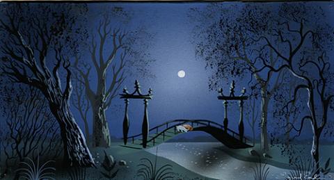
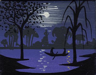
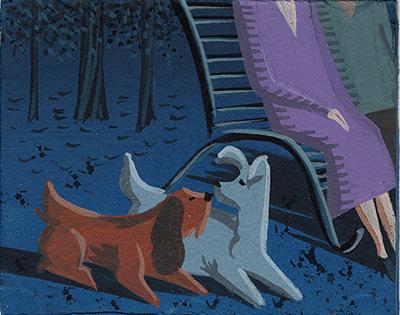
Though he mainly worked as a background artist, Earle was also assigned to create concepts for Sequence 7, known as “Bella Notte.” This sequence comprised Lady and Tramp’s moonlight walk through the park after their meal at Tony’s. According to Earle’s own autobiography, Horizon Bound on a Bicycle, “One day Walt came into my room, and simply said to me, ‘I want you to do the backgrounds for the park sequence.”

In a film already set within the nostalgic world of turn-of-the-century America (a setting Walt was simultaneously creating for Disneyland’s Main Street, U.S.A.), the walk in the park only intensified the feeling of impressionistic romance in an age of genuine innocence. As Frank Thomas and Ollie Johnston would put it, “Lady and the Tramp was made of nostalgia, like an old postcard, with bright, sunny colors and soft edges.”
Many of the film’s early developers, including Grant and Walt himself, grew up during this seemingly idyllic period. Eyvind Earle, born in New York City in 1916, was perhaps a little too young for this nostalgia. Perhaps it was rather for his own perspective on the natural world that encouraged Walt and the creative team to assign Earle the “Bella Notte” sequence. This would be one of the few moments in the picture set in a natural landscape rather than the quaint city streets or homey interiors of the town.
Earle’s inspirational concepts caricatured the feeling of a romantic evening. Thumbnails depicted inhabitants of the park—frogs, birds, owls, rabbits, even crickets—each a seemingly loving couple. “You can see the encrusted trees and the shadows, and the very limited palette he uses, very simple shapes that read very well from across a room,” comments historian John Canemaker.
In the final backgrounds, Earle was also infusing similar elements of style used to extremes in Sleeping Beauty, though on a subtler level. Artist Hans Bacher explains, “you see stylistic similarities especially in the romantic night sequence. Or when you study some of the hedges, the same foliage design like in [Sleeping] Beauty’s forest.” This is seen both in the final backgrounds and conceptual designs. Trees from the park sequence resemble very much a tree from Sleeping Beauty, such as when Briar Rose sings in the forest. The only difference is that these distinctively Earle designs do not overwhelm the film. For “Bella Note,” it accentuates the emotion of what is supposed to be a highly romanticized moment. The impressionism of the designs do survive more fully in the final backgrounds of this sequence more than elsewhere in the film, reflecting just such a mood. According to Earle’s autobiography, this work on the park sequence coincided with some of his work on Sleeping Beauty. Indeed, Earle spent upwards of four years on the feature, the full production lasting more than six.
Lady and the Tramp was the first Disney feature produced in CinemaScope, a new form of widescreen developed in the 1950s to compete with the new product of television. For a Disney feature, this meant new challenges for the background and layout artists more than for any other group. The backgrounds had to convey interest and detail across a stage near twice the size of previous films, but still keep the focus on the characters.

Specifically for Lady and the Tramp, the cinematography, and in effect the backgrounds, were based from a dog’s point of view. Disney producer Don Hahn comments, “when you’re down that low, it’s a very horizontal world; the world’s not defined by the sky, it’s defined by the floor and the carpet and the lawn and the fire hydrant.” This proved particularly apt for the stationary camera style of CinemaScope features. Earle personally was able to stretch his artistic muscles with the widescreen in practice for the even fuller demands of Sleeping Beauty’s panoramic backgrounds.
Lady and the Tramp’s premiere, in Walt’s own birthplace of Chicago, came just a month before the opening of Disneyland Park in June of 1955. Earle’s remaining work for Disney would be dominated by Sleeping Beauty, the film from which Disneyland’s new castle centerpiece took its name, but was still nearly four years away from its debut.
“The extraordinary thing about working at Disney’s,” recounted Earle, “was the fact that I was suddenly surrounded by hundreds of artists and hundreds of them were good artists.” Throughout his years at The Walt Disney Studios, Earle was both pushed to paint a menagerie of subjects and exposed to a multitude of styles and artistic approaches. In a way, Earle became the artist he would be for the rest of his life whilst working for Walt.

Lucas O. Seastrom is a writer, filmmaker, and contracting historian for The Walt Disney Family Museum.
