Our guest curator this week is Lynn Zook. Lynn is our Digital Archivist and is part of the Collections team. We asked her to pick her favorite artifact from the Collection and write about why she chose it. Here's her pick:
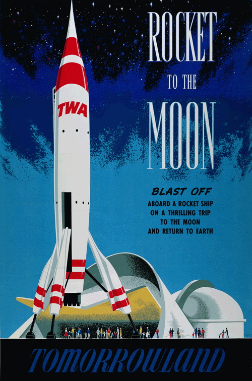
As a child growing up in the 1960s, I was like most kids, not always appreciative of the world around me. Having grown up in Las Vegas, however, I did have a big love for neon signs and roadside architecture. It wasn’t until the first family trip to Disneyland in 1967, that I truly discovered mid-century modern Disneyland and its influence on graphic design.
Mid-Century Modern architecture and design were born out of the post-war era when America was the dominant world power and the country was alive with the feeling that anything was possible. The space race in the 1950s helped put sputniks on signs all across the country whether they needed them or not. Out here in the West where the aeronautic companies were building the engines that would take us to the moon, the “Jetsons” age architecture was embraced from “googie” coffee shops to commercial buildings to housing tracts.
In many ways, Disneyland and Tomorrowland, especially in its early incarnations, were graphic testaments to that era.
My friend Alan Hess, author and respected authority on all things mid-century modern, writes “The bold primary colors, clean open compositions, and strong abstracted shapes seen in the faux-travel posters lining the ticket kiosks and entry tunnels to Disneyland could also be seen in the popular media everywhere, from magazine advertisements to animated cartoons (see Chuck Jones' Bugs Bunny, Jay Ward's Rocky and Bullwinkle, and Terrytoons' Tom Terrific cartoons.) Disneyland, and especially Tomorrowland, not only reflected this trend, its design was the very embodiment of the American public's optimistic hopes for a progressive Modern future, to be experienced in everything from commercial space travel to picture phones hanging on your kitchen wall.”
“Many Disney artists were already well grounded in these modernist trends, which had been nurtured in Los Angeles art and architecture schools like Chouinard and the University of Southern California. The influential California School of artists included many painters, such asMary Blair, who developed this style in their fine art, and also worked for Disney. Tomorrowland offered an excellent opportunity for these modern, forward-looking designs to be applied in the sleek shapes of the architecture and the streamlined shapes of Autopia, the TWA Rocket Ship, and the Carousel of Progress.”
Walt’s good friend and neighbor, architect Welton Becket, had been approached to help design Disneyland. Becket, one of the premiere architects in Los Angeles whose many mid-century modern buildings are today icons of the city, told Walt, “you don’t need an architect, you need the directors and artists you work with”. Talking himself out of job, Becket believed that Walt would be better served by the men and women who helped create the fantasy world of his films.

General Electric Pavilion at the NY World's Fair
Becket and Walt would work together for the New York City World’s Fair in 1964. Becket designed both the GE pavilion for Walt’s Carousel of Progress and the Ford pavilion for the Ford Skyway to Tomorrow.
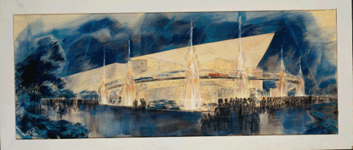
Ford Pavilion rendering for the NY World's Fair
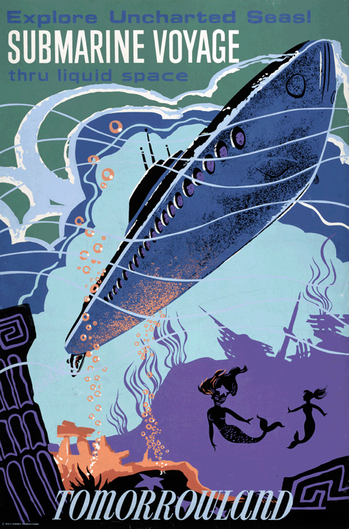
On that first family trip to Disneyland, I fell in love with the large, movie-style travel posters that greeted visitors as you entered “the happiest place on earth”. More than some of the rides, those posters burned their way into my ten-year old brain where they helped to spark the mid-century modern enthusiast I would grow up to become.
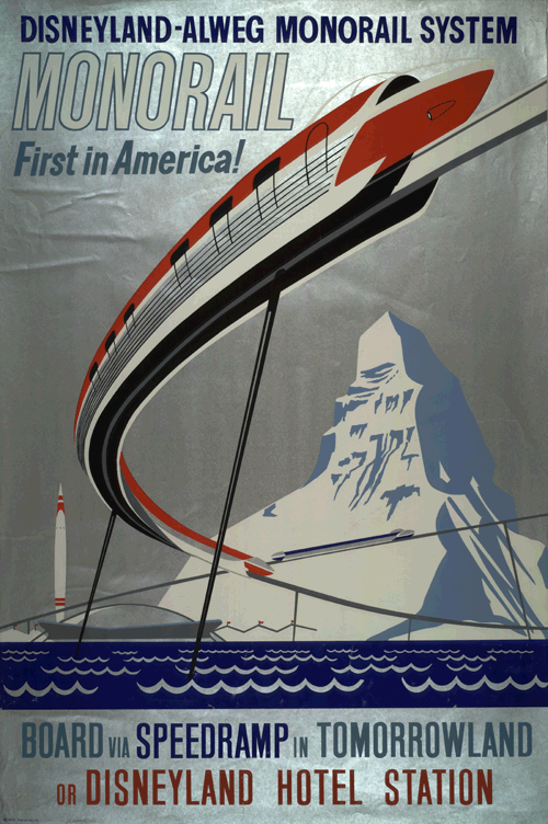
Those posters, which were basically advertisements for the rides that were inside the park, are wonderful testaments to that era. They are graphic reminders to all of us of a certain age of the Disneyland of our childhood. From the submarine ride to the Monsanto Trip Through Inner Space to the Rocket to the Moon, they all capture the mid-century modern esthetic in their design and their whimsy. They also offer an amusing look into what we thought the future would be like. Well, now that that future is here, am I the only one still wondering where my jet car is?
When my husband, Jon, and I first visited The Walt Disney Family Museum last December, we were blown away by the exhibits and galleries and all the technology inside.
But it was the posters, downstairs in the lower lobby, which captured our hearts. We were disappointed to discover that we couldn’t buy reproductions of them in the gift shop (though, honestly, it likely would have busted our vacation and Christmas budgets because we would have had to have one of each).
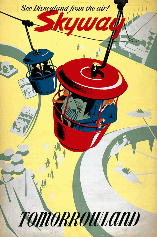
Now, I am fortunate to see those posters and some of the beautiful concept art for Tomorrowland on a regular basis. Each time, I smile broadly and say a heartfelt thank you to those artists who captured my imagination over forty years ago and taught me to embrace my love of mid-century modern architecture and design.
